Let's take this little old aardvark from here, because everyone wants one in their dungeon.
.png) |
| Victor |
- clean the shadow up
- use the paint bucket to surround it with a distinctive color
- select that color
- invert selection
- delete
- use the paint bucket to fill the resulting hole with black
- invert selection and delete your distinctive color
- save as a png
b.png)
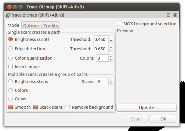
You can go to the View menu to zoom in. Then select your little guy and go to the Path menu and select Trace Bitmap. It will bring up this wonderfully confusing thing here:
You can move that to the side to see how it looks. If it passes muster, select the old image and delete it:

Now you will have an svg that you can import into Gimp any time you need a non-vector, or raster, version of the image-- like in Blogger or LibreOffice. Click on the svg and open it in Gimp and you'll get a dialog that looks like this:

So, from what I understand, 300 DPI is the highest resolution that will make any difference on the printed page, so if you aren't working digitally, no reason to go higher than that. Whatever number you decide on, put it in the Resolution box. Then pick the size you want in width and height. And it will make an image that you can edit or just save as a png. Ours came out like this:
c.png)
Now, I want to go back to Inkscape for a bit. This is in case you have a pretty smooth silhouette already and tracing it is making it look too computery. What I've found to work okay, is to leave the default Brightness Cutoff selected but lower that threshold to something like .05.

More importantly, click that Options tab:

and unselect Smooth Corners and Optimize Paths. That should trace almost exactly what you have in your original image.
On the other hand, you may want something a lot smoother. If so, once you've traced your svg, with it selected, go to the Path menu and select Simplify.
That will basically remove data points from the line of your image. I used this to get the slippery smooth snake in my last post. But after hitting it three times in a row, poor Victor looks like this:
d.png)
I hope that is helpful. I know people make a living doing this stuff and know tons more, but this is enough to let you make some cool handouts and DM aids. If you have any questions ask them in the comments. I'll do my best to answer or maybe someone more knowledgeable can.


Attending closely!
ReplyDeleteI have only recently discovered the amazing power of high contrast to clean up line drawings. I use a similar procedure to the one you describe in the first part of this post. I crane the contrast so that there is only black and white lines left. I color white anything I don't like. Select white and remove (clear).
ReplyDeleteThanks for the tip about using inkscape to further clean up the image. That is slick.
@Roger: There might be a pop quiz! :)
ReplyDelete@Joe: Thanks. Also, check out "Levels" in the "Color" menu of Gimp. I've found it is more flexible than using contrast. You can whiten an image to get rid of background grunge and then bring up the black to make sure you don't lose detail. It's also the way I made all the grey watermark-like images for the recent beasts of burden posts.
Very nice stuff. I don't like simplifying paths, since you lose a lot of the details like claws, angles between the legs and body, etc., that indicates things like the speed and agility of the animal. The simplified Victor reads like a stuffed animal to me.
ReplyDeleteAbsolutely, that's what I hated about vector graphics that I mentioned in my last post. I include it here as another tool that can come in handy for certain logos, or specific shapes.
ReplyDelete